This was my original idea for my contents page. I did like the layout of this, yet I faced difficulties with fitting all the text onto the page with the large image to text ratio. I therefore researched more contents pages online for inspiration and changed my design.
From my research before beginning my practical work on my contents page, I decided to take inspiration from 'Vibe' Magazines contents pages. I really liked the significant brand identity used with the letter 'V' placed as a background image throughout all issues of the magazine. I decided to implement this into my magazine and have a large letter 'M' placed on the contents pages, signifying the brand identity of MODA.
Using information I gathered from talking to my focus group, it helped me make decisions such as the price of the magazine and I also gained general feedback with quick questions about the layout of my draft front cover. The research also helped me decide to make a link to a snapchat page for the magazine on my website, as snapchat is a highly used and accessible platform that 16-25 year olds gain their news sources from.
These were my favourite photos from my first photoshoot. I therefore made a mock front cover of each of them and asked my focus group and further people from my target audience which cover they liked the best. The fourth photo and the sixth were the most popular designs and I decided to take upon these further.
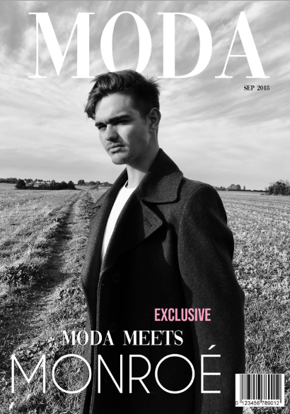
After a further mock up of the two magazines, the feedback favoured the second magazine cover due to the bold image and facial expression of the model and the cloudy background behind the masthead. This made my decision clear to use the second photo as my front cover image.
I was deciding between these two photos for my front cover image. I therefore placed them into the format of a front cover, following the same layout as my first front cover (including masthead typography etc.). I then asked my focus group which one they preferred and the responses helped me decide to use the second layout.
I
will use intertextuality by displaying an ‘exclusive interview’ with my male
model, with reference to his new role in the media text ‘Stranger Things’. I am
representing him similarly to actor Dylan O’Brien, a young and attractive social
group stereotype, that is aspirational for the male audience and stereotypically
attractive for the female readers. Below are some examples that I used as inspiration for my photoshoot, including Dylan's Teen Vogue campaign:
I dressed my model up to have a similar style and iconic look to the model Gigi Hadid, which is an example of intertextuality. I am assuming the cultural competency of my audience by paying homage to a celebrity that I think may be aspirational to them.
My front cover image presents a strong and iconic pose, inspired by the likes of Lily Rose Depp, Kylie Jenner and Georgia May Jagger.
This 'Erroca fall eyewear' campaign features actress Gal Gadot. I liked the sunglasses and rose as props, so decided to think of ways in which I could incorporate this into my photoshoot. The red rose does not only have connotations of love and romance, but adheres to my theme of sophistication and class. These are some of the photos I produced in my photoshoot: